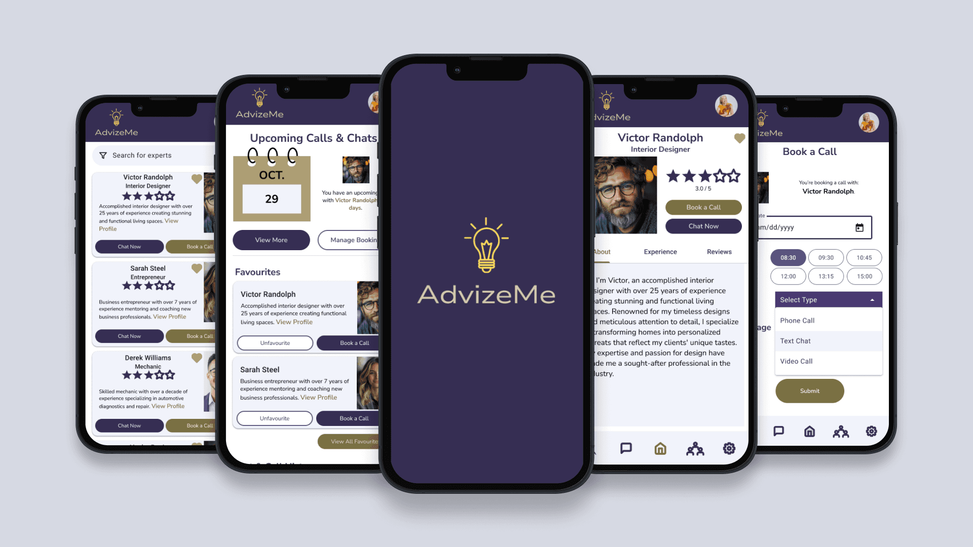
A platform designed to connect users with verified professionals across diverse fields—offering real-time, personalized advice through flexible communication options.
Users rely on unreliable or unverified online advice, leading to poor decisions or forcing costly, in-person consultations.
Design a trusted, real-time consultation platform (web/mobile) that allows for instant connection with verified experts.
Established a scalable architecture for expert verification and communication.
Designed intuitive, multi-modal communication flows (chat/video).
Reduced decision-making friction by 35%
This case study explores how my solution addresses the critical gap between generic online advice and expensive traditional consultations.


Users need an easy, intuitive way to get help with occasional tasks from industry experts. They want to feel informed and prepared to tackle their problems but struggle to find suitable solutions on their own.

Information Overload - Overwhelming & contradictory information online
Conversation Barriers - multiple modes of communication + follow ups
Time Sensitivity - long wait periods for responses
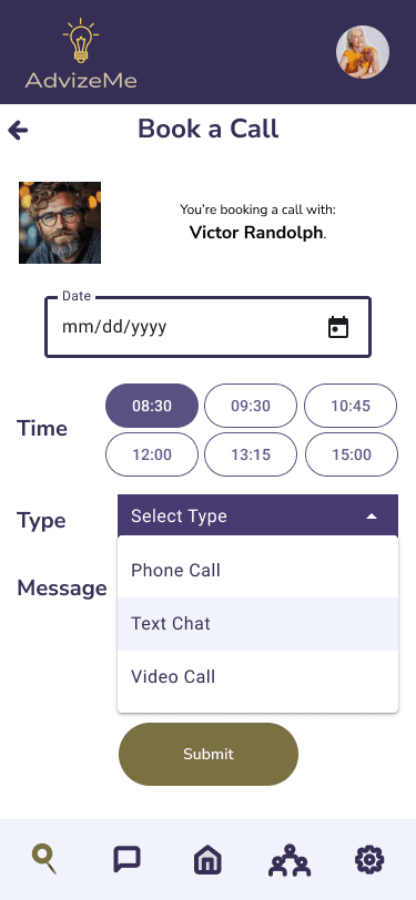
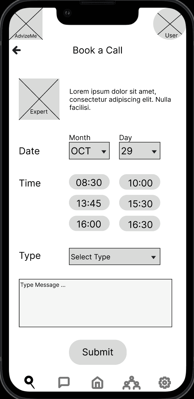
Instant Expert Access – Multiple communication options (phone, video, text).
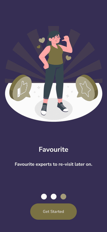
Trusted Network – Verified professionals to ensure credibility and reliability.
User-Centric Accessibility – Designed for diverse needs and seamless expert connections.
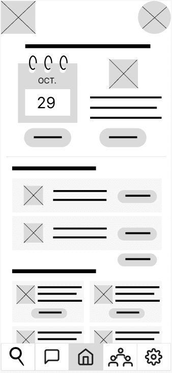
User flow without AdvizeMe.
Throughout the ideation, i kept the following core design principles in mind to ensure user-centric solutions validated by the competitor and user analyses above:
Trust Through Transparency
Flexibility in Communication
Contextual Efficiency
Relationship Continuity
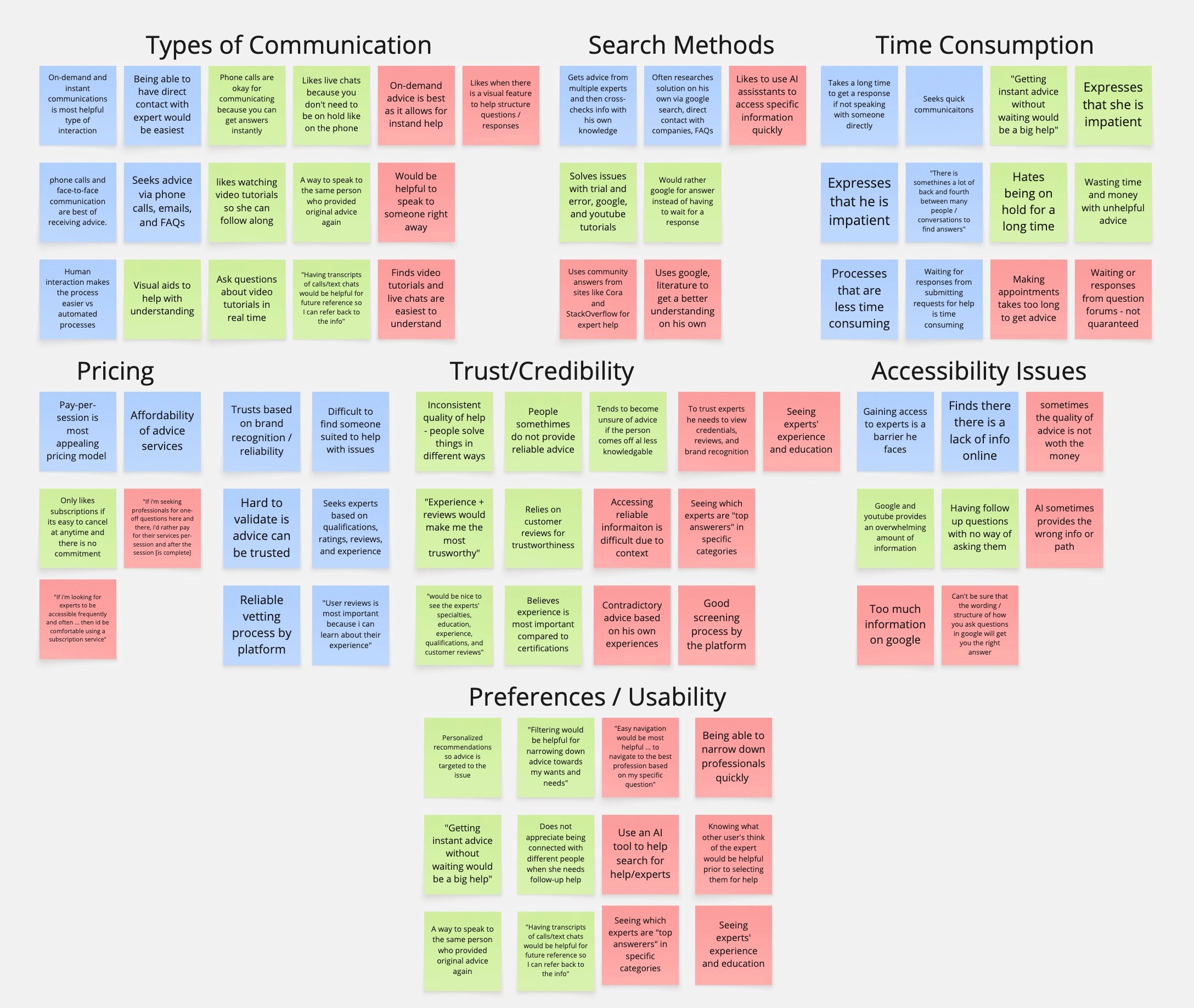
My ideation process focused on addressing three critical barriers:


To validate that AdvizeMe would truly solve the problems faced by users like Gabriel, I conducted moderated in-person usability tests with ten participants who represented our target audience.
The following are the key issues that resulted:
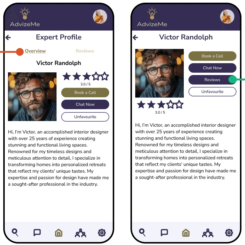
Expert profile before & after.
Issue:
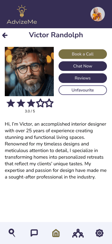
50% of participants struggled to find the “Reviews” tab due to low visibility, making it difficult to assess expert credibility.
Solution:
Redesigned the reviews section with a clearly labeled, high-contrast button to improve discoverability.
Impact:
Users like Gabriel can now verify an expert’s trustworthiness via reviews, reducing hesitation and decision fatigue.
Issue:
83% of participants expected the back button to return them to the expert’s profile rather than the general search results, disrupting their workflow.
Solution:
Adjusted the back button behaviour to maintain content, keeping users on the expert's profile after viewing reviews.
Impact:
Users can efficiently evaluate experts without losing their place, enabling faster decision making.
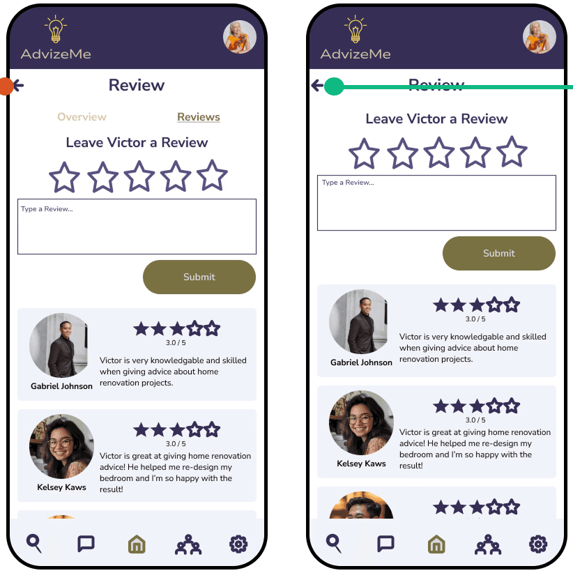
Expert reviews back button before & after.
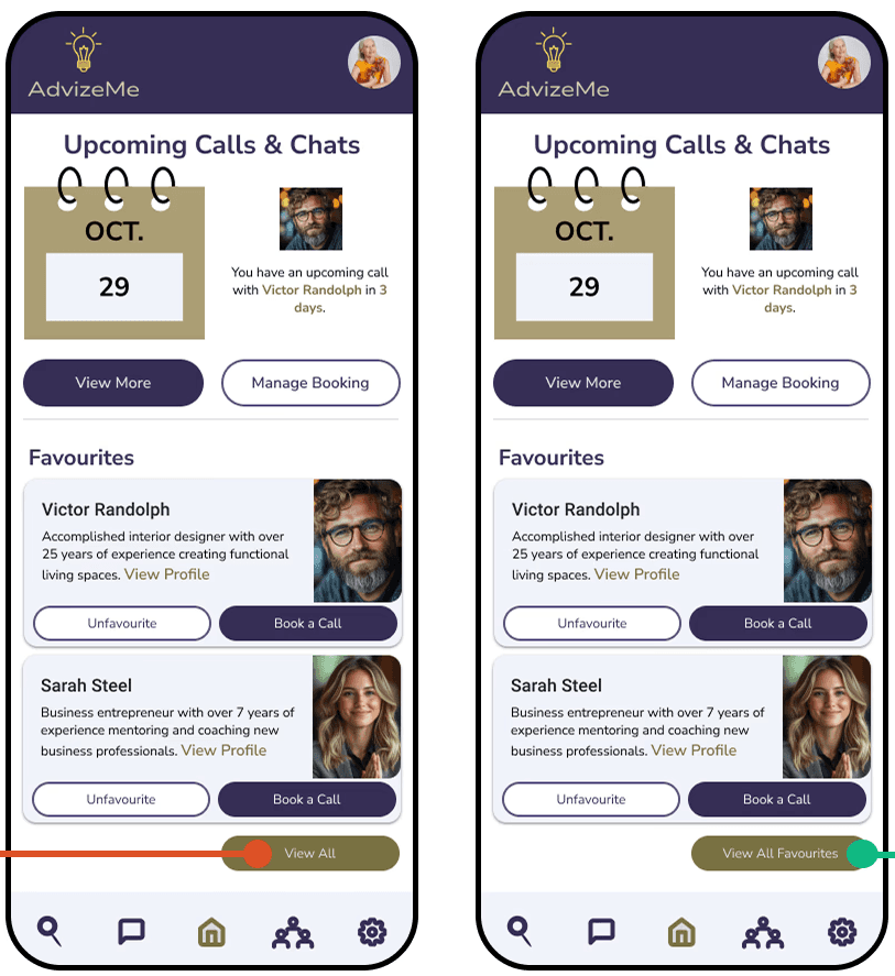
Dashbboard favourites button before & after.
Issue:
30% of participants misunderstood the “View More” button in the Favorites section, slowing down access to previously used experts.
Solution:
Renamed the button to "View All Favourites" to eliminate ambiguity.
Impact:
Users can quickly access and reconnect with trusted experts, streamlining their workflow when seeking follow-up advice.
Issue:
50% of participants expected expert cards in the Favorites section to be clickable, mirroring their behavior in search results.
Solution:
Made expert cards interactive across all sections, creating a seamless, predictable user experience.
Impact:
Users like Gabriel can navigate the platform more fluidly, avoiding unnecessary friction when selecting experts.
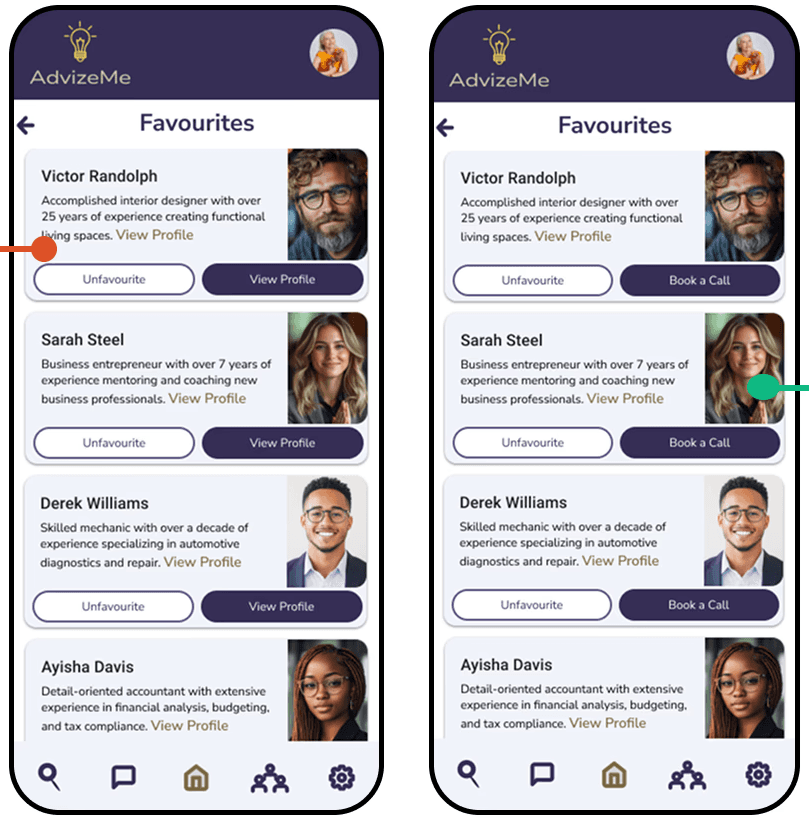
Card navigation before & after.
These improvements directly addressed the friction points that would have hindered the experience:
Access to trust-building features
Intuitive navigation
Consistent interaction patterns
These refinements ensure quick access to expert advice, trust validation, and an intuitive user journey.
User flow using AdvizeMe.
My peers identified several refinements that would directly address Gabriel's needs for efficiency and clarity:

Skip button added to Onboarding screens.
Added a skip button to the bottom of onboarding screens, maintaining consistent button placement throughout the app.
Allows immediate access to the login screen without unnecessary steps
Added each expert's profession under their name on favorite cards, search results, and expert profiles.
Allows for quickly identifying relevant expertise without diving into detailed profiles.
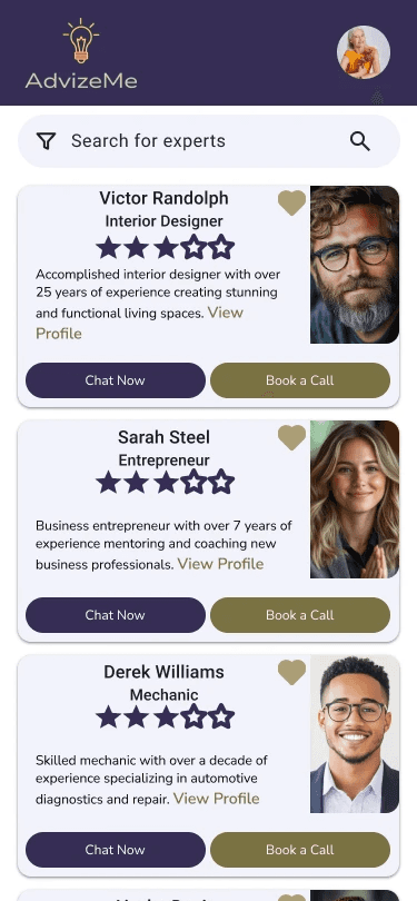
Expert profession added to cards.

Tabbed navigation added to expert profile.
Redesigned the profile screen with tabbed navigation to organize different types of expert information.
Ensures users can efficiently review credentials while maintaining easy access to connection options.
View Prototype
User satisfaction scores (target: 4.8/5)
First-consultation completion rate (90%)
User retention (60% returning within 30 days)
Future Enhancements:
AI-driven matching system that learns from past interactions to suggest the best experts.
Gamification component that rewards users with trophies and medals.