This case study focuses on how an outdated website was re-designed into a responsive website to foster trust, clarity, and efficiency upon first impression.
Willchris Kennels is a family-owned staple with a 35-year legacy of exceptional pet care. While their physical service is premium, their digital presence was outdated, relying on a confusing booking flow, aggressive visuals, and dense, disorganized content that overwhelmed users.
The original site suffered from extreme information overload. Critical service details were buried in "walls of text," causing high cognitive load. Combined with a confusing third-party booking requirement ("Gingr") and an "industrial" color palette, users felt lost, anxious, and overwhelmed.
Information Architecture: Reorganized massive amounts of content into digestible, scannable layouts (Cards & Tabs).
The "Bridge" Strategy: Designed a guided flow to manage user expectations and the complex third-party booking software.
Visual Rebrand: Shifted the identity to a "Playful Oasis" to align with the compassionate quality of care.
Validation testing resulted in: a 100% task success rate for new user registration and significantly faster information retrieval, proving that complex information can be made intuitive through proper hierarchy.
Tools
Timeline

Willchris Kennels is a family-owned staple with a 35-year legacy of exceptional pet care. While their physical service is premium, their digital presence was outdated, relying on a confusing booking flow, aggressive visuals, and dense, disorganized content that overwhelmed users.
The Goal: Modernize the brand to attract new pet parents while making the website feel trustworthy, intuitive to use, and well organized showcasing all services options offered for best care.
The current website's confusing information structure and complex booking flow create unnecessary anxiety and friction, hindering Willchris Kennels' brand promise of stress-free, premium care and reducing client engagement with high-value enrichment services.
Reality Check (Constraints):
Custom Backend: Budget limitations prevented a custom booking portal.
Mandatory Workflow: Users must register via the external "Gingr" software.
Content Volume: The site must house extensive policy and facility information for legal/safety reasons; we couldn't just delete it.
The Objective: Reduce Cognitive Load by presenting heavy content and in a way that felt light, scannable, and supportive.

Easily book stays for her dog when she goes out of town.
Dog care & safety
Find information easily without feeling overwhelmed.
Cognitive Barrier: bombarded with dense paragraphs of text, completely missing information that would foster trust.
Visual Barrier: The dark, angular "Red & Black" palette triggered "Warning" signals.
Process Barrier: The page explaining the "Gingr" third-party made her feel overwhelmed as the information was disorganized.
Improve information hierarchy by organizing + styling content
Create a more intuitive booking flow through managing expectations
Updated branding and UI to better align with company voice & values.
By designing with users like Jessica in mind, Willchris directly addresses the challenge of making the website and brand feel trustworthy, intuitive, and organized.

I mapped out three key user stories reflecting common scenarios for new and returning customers. These helped define how users navigate the site and identify the screens, decisions, and actions involved in completing core tasks.

With the user flows mapped out, I created sketches with initial ideas, then transformed them into mid-fidelity prototypes using a mobile-first approach to visualize layout possibilities and test how content might be re-arranged to improve the UX.
My early wireframes focused on solving challenges identified by UI audits:
Information hierarchy & layout
Overall content & information
Booking / registration flow
View Mid-Fidelity Prototype


How might we improve the layout to enhance information hierarchy in an efficient, clear, and scannable way.
Create a simple and intuitive layout by organizing information into scannable sections, cards, and tabs allowing users to easily digest the information at first glance.
How might we create a better user experience and foster trust through the content on the website?
Enhance the body-copy to communicate more clearly and efficiently to the user as well as to better align with brand voice and identity, keeping it playful but professional.


How might we create a more comfortable experience for registering with the mandatory third-party?
Manage expectations by clearly communicating the registration/booking process in an easy-to-process way using graphics to relieve cognitive load.
Before continuing on to iterating into high-fidelity, I testing the mid-fidelity prototype on 4 participants from the target user group via moderated in-person task-based testing methods.
The Urgent Issue: Testing showed that users ignored the navigation menu and chose to scroll, getting lost in the "Wall of Text."
The Fix: Based on user feedback, I inverted the homepage hierarchy to better align with user's goal of understanding the kennel and what we offer before being shown booking instructions.
Once I addressed the most severe issue, I continued with high-fidelity iterations.
Usability Testing Report
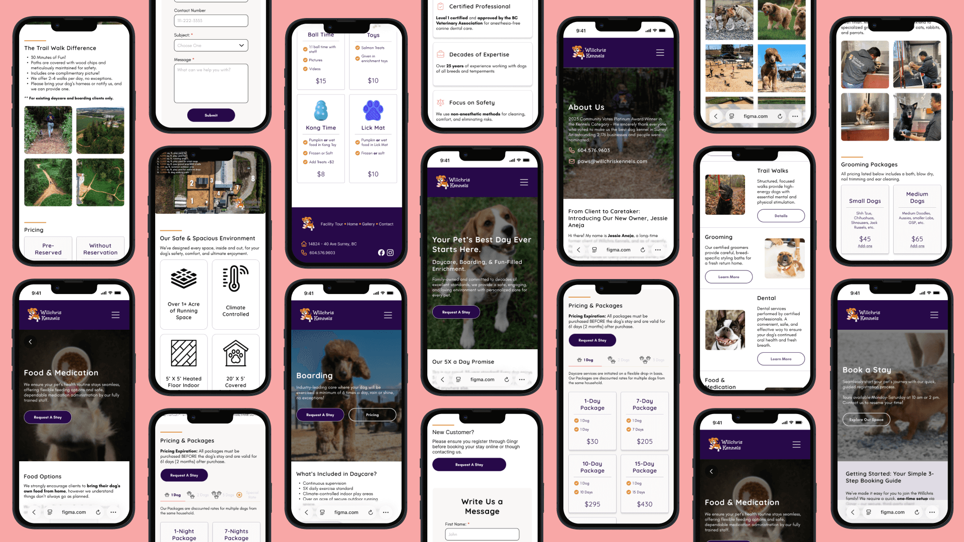
Once the core layout and functionality was validated, I began mid- and high-fidelity iterations to refine the user interface, enhance visual hierarchy, and begin incorporating branding elements (typography, colour, and iconography).
By comparing mid- and high-fidelity wireframes side by side, you can see how the structure evolved into a cohesive, branded experience.
Added imagery and icons
Added brand colours and logos
Enhanced the UX with an "About Us" CTA
Re-designed layout styling to add section lines for easier viewing


Added imagery and icons
Added brand colours and logos
Reviewed the content and information to help users better understand the need for the third party app, managing their expectation about the non-conventional registration/booking process


Added imagery and icons
Added brand colours and logos
Refined tab and card styling to improve scannability
Improved white space and partitioning to be easily digestible


I brought the Willchris redesign to life through an interactive prototype. This final design reflects the full experience: from learning about the kennel and services offered to building trust with new customers and an intuitive registration process.
Below is a walkthrough of the prototype in action, along with a selection of final screens that highlight Willchris' playful brand, clear communication, and ease.
View Prototype
While the design was Mobile-First to suit on-the-go customers, the Desktop experience was critical for "The Planner", who prefers deep research on a larger screen.
The goal was to maintain the "Oasis" calm across all devices by adapting the UI to the user's context.

The Pivot: From Industrial to Soft The old site used sharp angles and aggressive high-contrast colors (Black/Red). This contributed to the feeling of being "yelled at" by the text.
Design System


Working on Willchris' redesign allowed me to deepen my understanding of UI and UX design along with navigating budget and technical constraints while staying focused on real user needs. Through each phase of the project, I built both practical skills and strategic thinking that I’ll carry into future design work.
Willchris now provides users with an easy to follow booking process which manages expectations and clearer communication through improved information hierarchy and content.
Willchris' brand is now presented through UI that aligns with the brand's voice of playful yet trustworthy, offering exceptional pet care and services.
The final solution effectively supports users like Jessica providing clear, efficient, and trustworthy communication.
Being unable to build a custom portal forced me to focus on Guidance. I learned that a good designer doesn't just build tools; they build the support systems around them.
Explaining why a user has to use Gingr (third-party registration app) was just as critical as the visual layout.
I learned that "Cognitive Load" is a trust issue. By breaking dense information into digestible cards and clear steps, I didn't just make the site easier to read; I made the company feel more organized and trustworthy.
Collaborate with stakeholders and developers to compile handoff materials and ship product into production.
Conduct validation testing and gather continuous feedback from customers to validate assumptions, and uncover opportunities for refinement.
Continue polishing visual design details, such as spacing, imagery, and microinteractions, to elevate the overall user experience.